
Core Approach
To inform communities about the factors contributing to the decline of corner stores and the consequences of reduced local engagement. Encouraging renewed support for these local businesses.
Goal
A data-driven poster that presents researched information through clear charts and visualizations. Enabling the community to understand the issues quickly and effectively.
Solution
“THE CORNER STORE IS NOT JUST A PLACE TO BUY MILK - IT’S WHERE THE SOUL OF THE NEIGHBORHOOD LIVES.”
- Bryant Terry, Food Justice Activist & Author
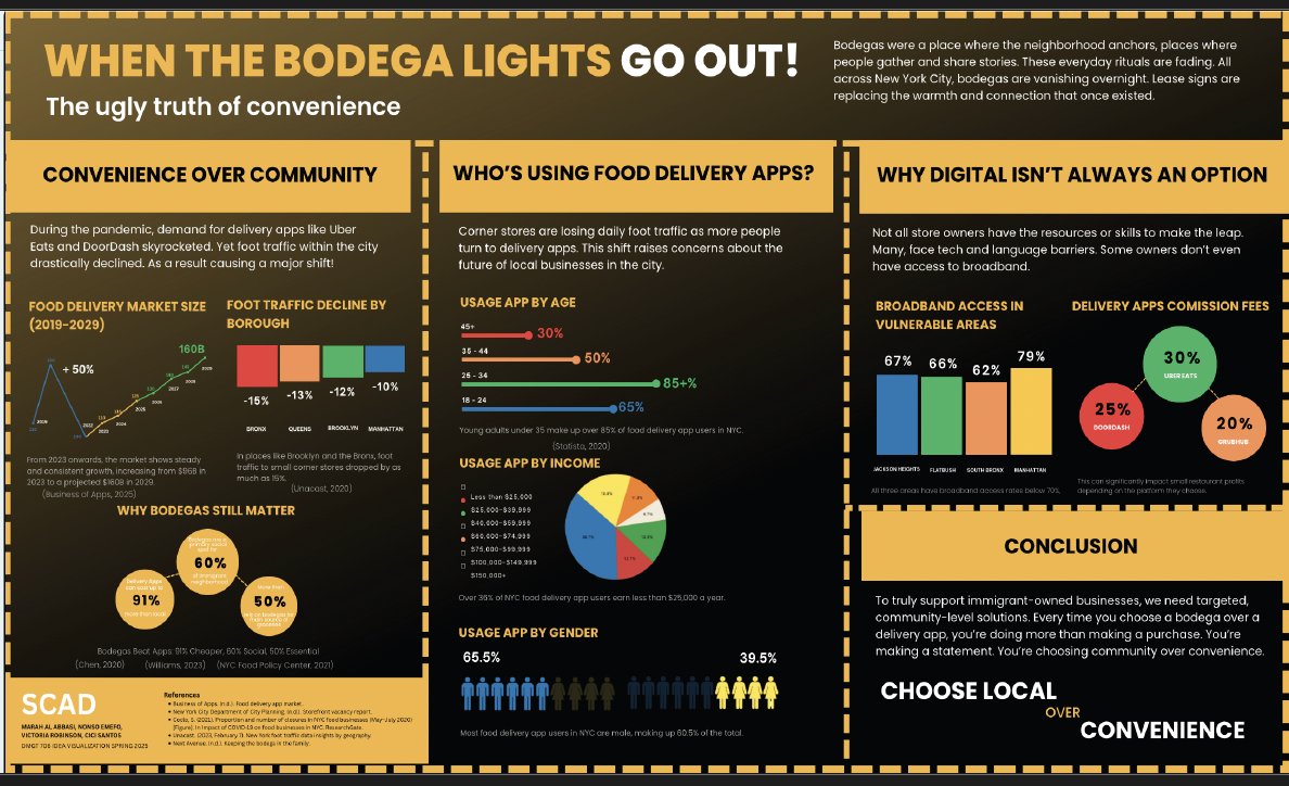
Design Features
Information Visualization: Translates research findings into clear charts and graphic elements that enable rapid comprehension of key trends and community impact.
Structured Typography: Implementation of disciplined hierarchy that guides viewers from contextual framing to data insights and action-oriented messaging.
Targeted Color Strategy: Applies a high-contrast palette selected to align with the visual preferences of the projects primary male audience.
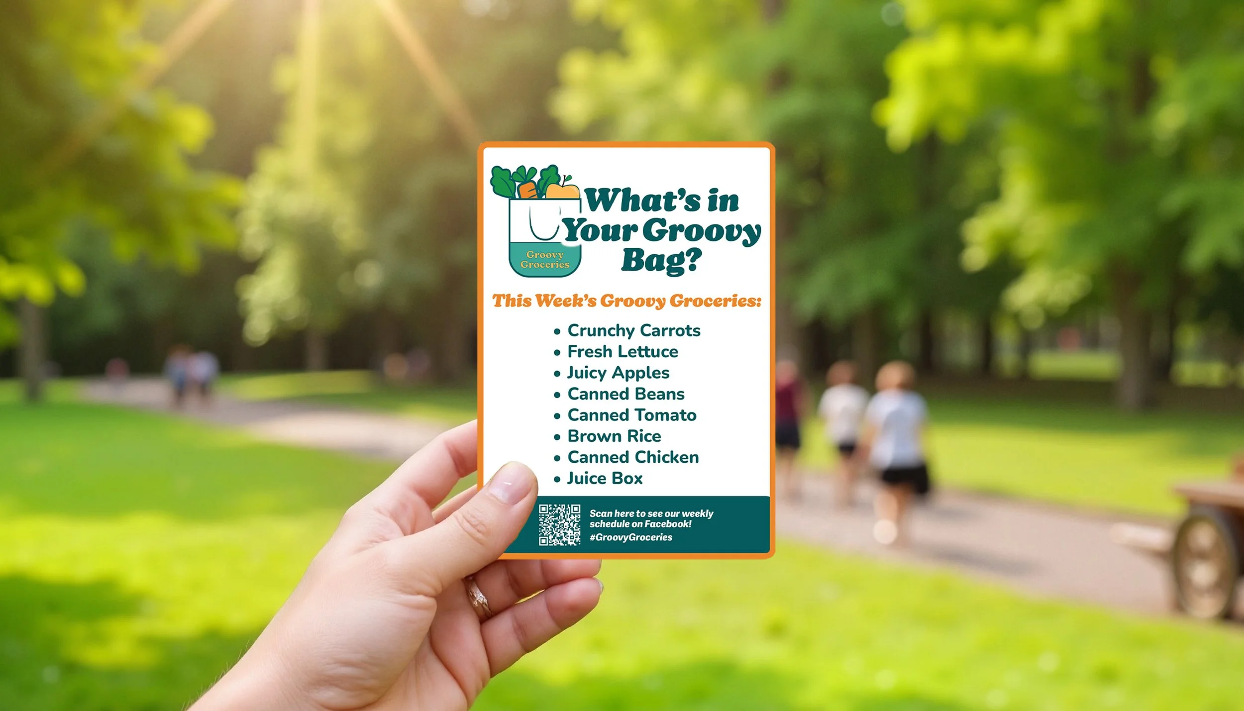
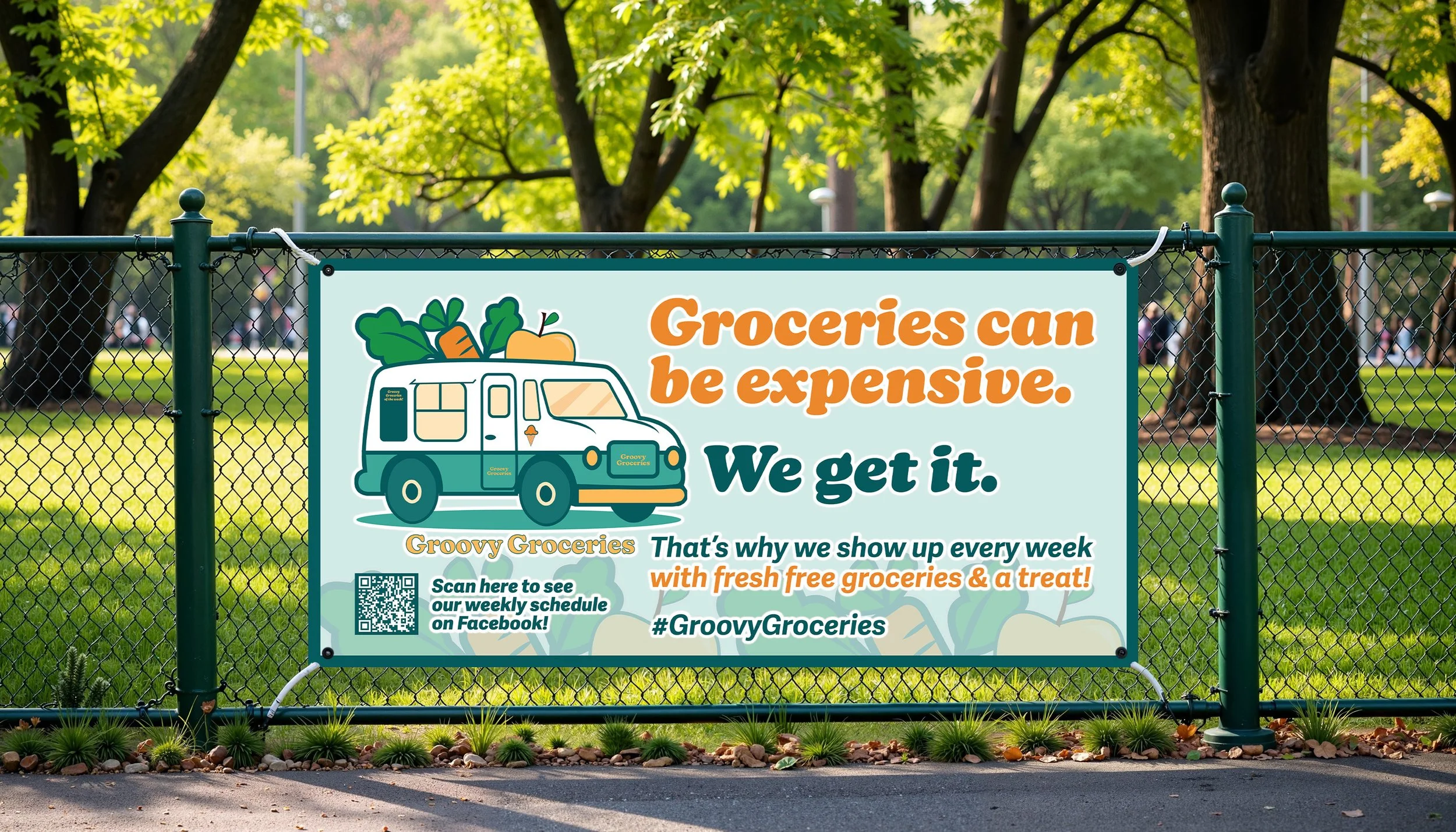
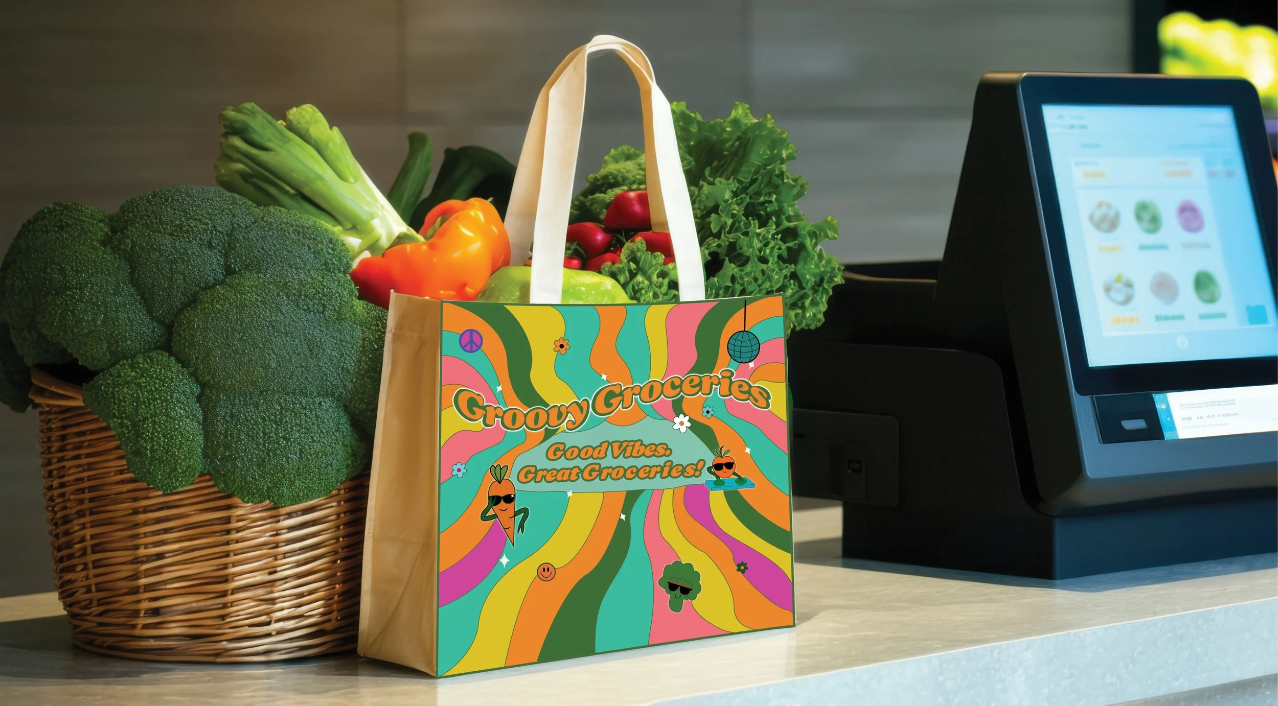
Design Ideation
Explored mobile truck layouts, playful retro branding, vibrant color palettes, and applications for social media and bus stop graphics to shape the Groovy Groceries brand.
RESEARCH & DESIGN PROCESS
INITIAL IDEATION
Identified unclear hierarchy in a multi-column layout. Refined the design by exploring poster structures, typographic clarity and concise data visualization. Implemented high-contrast black and yellow color schemes to effectively engage the community.
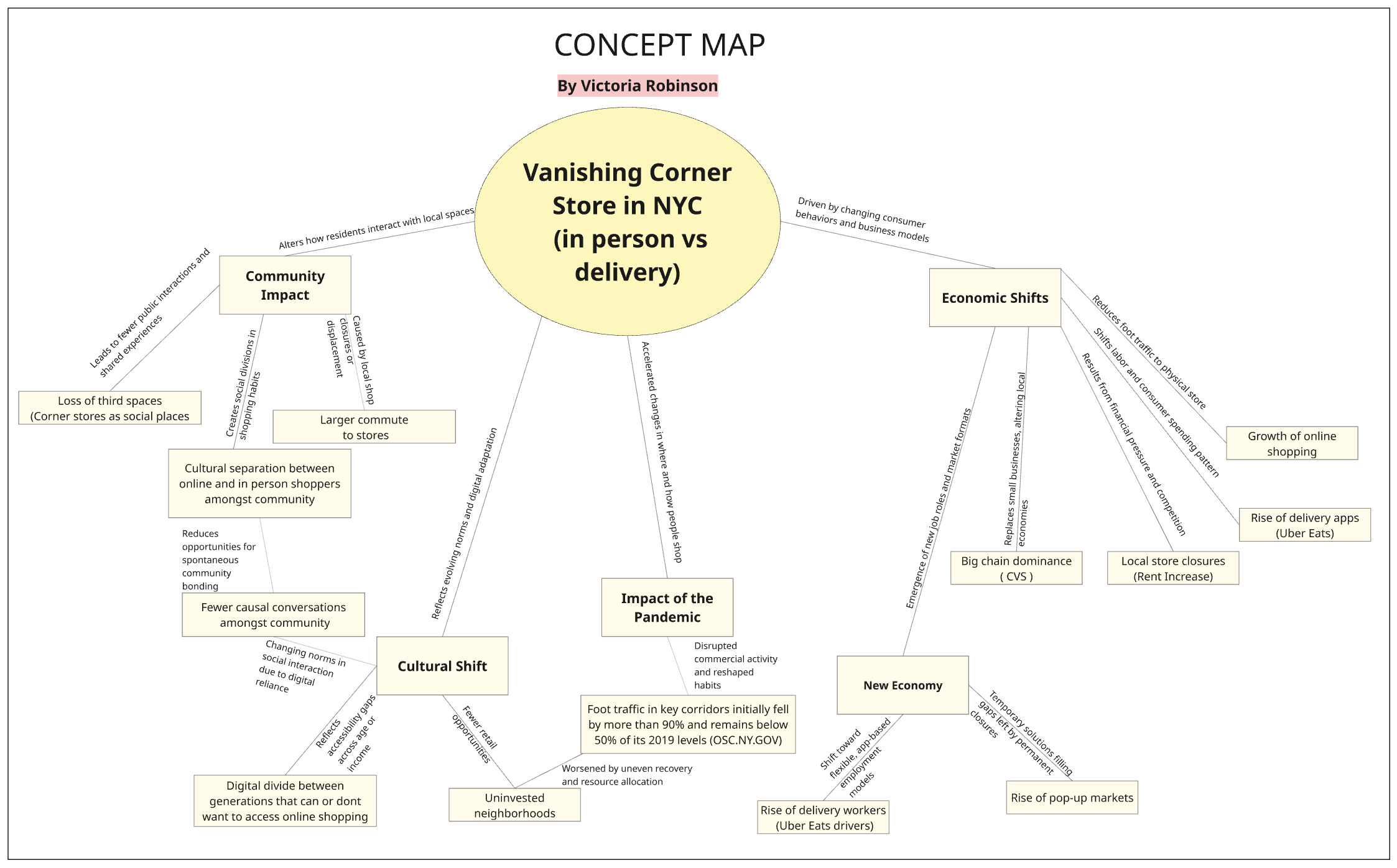
CONCEPT MAP
Visualized the connections in Vanishing Corner Stores, highlighting community impact, longer commutes and social and cultural consequences.
DELIVERY STATS
Visualized the rise of the delivery market in a line graph, highlighting shifting consumer habits, evolving access patterns, and emerging social and cultural effects.